Is this S&P rebound the real deal? … what we can learn from two important technical indicators … the technical reasons for caution ….
As I write Wednesday early-afternoon, the huge gains we enjoyed this morning have largely disappeared.
The Nasdaq was up 2% shortly after the opening bell. But a moment ago, it briefly went negative. Who knows where it will be by the end of the day?
Stepping back, from a trading perspective, is the S&P’s rally yesterday and this morning evidence of a bullish move that you want to buy into?
Or does the selling pressure from the last week and the fizzled rally from this afternoon mean that more caution is warranted?
Today, we’ll answer that.
To help us, we’re going to view the market through the lens of one of most powerful trading approaches out there – “stage analysis.” This is the cornerstone of Luke Lango’s trading system in Breakout Trader.
If you’re less familiar with this stage analysis, the concept is straightforward…
At any given point in time, an asset is either going up, down, or sideways.
To that end, it’s always in one of four unique stages: 1) going sideways at a bottom, 2) going up, 3) going sideways at a top, or 4) going down.
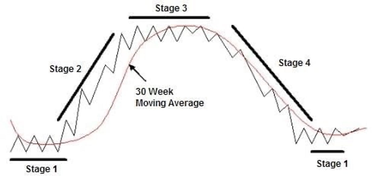
Though there are more details related to the timing of buys and sells, broadly, stage analysis is the science behind figuring out which of these four stages an asset is in at any given point in time, and then buying only when it’s climbing higher in Stage 2.
So, where do we start in our analysis?
Well, what stage are we in today?
Despite the heavy selling pressure since mid-July, the S&P remains in a long-term Stage-2 breakout
For a visual on this, below, we look at the S&P over the last two years.
We’re adding two trend lines that show us the S&P’s approximate Stage-2 breakout channel. The price oscillations don’t fit perfectly within our channel, but we’re close, capturing most of the price movements.
I’ve added green and red circles that shows us the “support” and “resistance” points of our Stage-2 breakout channel. Note that over the last two years, when the S&P has fallen to support (green circles), it has immediately bounced and climbed higher (with a big exception last fall).
And when it has reached resistance (red circles), it has quickly fallen and traded lower (with its own brief exception last month).

So, our two main 30,000-foot takeaways from this chart are:
- The S&P’s primary trend – “up” – is clearly established, so we’re in a long-term Stage-2 breakout.
- The recent selloff since July has dragged the S&P toward the support line of its breakout channel but we didn’t reach it.
Now, yesterday and this morning, the S&P roared higher following weeks of selling pressure. Is this the beginning of a new leg higher that we want to buy into immediately, or is this a temporary spurt of bullishness before a new wave of bearishness takes us lower?
To answer this, Luke would point toward two key technical indicators that help us with entry timing.
What the S&P’s RSI and MACD tell us about potential entry timing
For newer Digest readers, the Relative Strength Index (RSI) is a momentum indicator that measures the extent to which an asset is overbought or oversold.
A reading over 70 suggests an asset is “overbought” (and likely poised to pull back as traders take profits) while a reading below 30 means it’s “oversold” (and poised for gains as bargain-hunters step in and buy).
Below, we look at the S&P with its RSI in the lower pane over the last two years. Notice the relationship between the S&P’s price action and when its RSI hits that oversold level of 30 as just happened on Monday…
What we see is that an RSI at 30 tends to mark a rough inflection point from “down” to “up.”
It’s not perfect – if we zoomed in on some of these points in time, we’d see some days of additional weakness in the S&P’s price despite an RSI at 30. But from a big-picture perspective, this is a helpful indicator that’s signaling a potential reversal and a bullish buy opportunity.
But let’s not jump in just yet.
What can we learn from the MACD?
The Moving Average Convergence/Divergence (MACD) indicator reflects changes in a price trend’s strength, direction, momentum and duration. Traders use this tool by analyzing the location of the MACD line relative to its signal line.
At its most basic interpretation, if the MACD crosses above the signal line, it’s considered a bullish crossover, and potentially a buy signal. The opposite is true as well.
Consideration is also given to whether the MACD and signal line are trading above or below the zero line. The farther the MACD and signal line are from zero, the more stretched prices are in that direction.
Below, notice what has happened to the S&P’s price after the MACD has reversed and executed a bullish crossover from similarly depressed levels.
If you’re having trouble seeing the chart, the takeaway is that a bullish crossover broadly marks the beginning of a new upswing in the S&P’s price. It doesn’t nail it perfectly. There are periods of further price declines, but with a timeline of a handful of weeks to a month, a bullish crossover serves as a strong indicator of a reversal in the S&P’s direction.
Now, to be clear, the S&P has not registered a bullish crossover yet. Plus, the direction of our MACD remains “down,” reflecting the recent bearish momentum.
Below, we’ll look at this on a six-month timeframe to make it easier to analyze. You’ll see the MACD is still falling beneath its signal line.
However, we do see an inflection of the MACD toward its signal line. This reflects the buying pressure from yesterday and this morning.
So, what does all this mean?
While we’re in the neighborhood of a bullish crossover that often corresponds with a rebuy opportunity, an official MACD “buy” signal hasn’t fully triggered.
But keep in mind, it’s rare that all your signals will line up perfectly at the same time, providing an airtight “buy” or “sell” signal. So, traders still must exercise their own judgement about entry/exit timing. These personal choices must reflect individual attitudes toward risk and reward.
So, an aggressive trader might look at this chart and say, “close enough. I’m going in.” In her corner would be the RSI having hit 30 and now bouncing, and the strong bullish price action in the S&P we saw yesterday and this morning.
However, a more conservative trader might say, “close, but not yet.” His reason for waiting would include the still-descending slope of the MACD (and lack of bullish crossover), the fact that the S&P didn’t fall all the way to the support of its Stage-2 breakout channel, and the price-action weakness earlier this afternoon.
Remember, heavy selling pressure like what we’ve experienced since mid-July often doesn’t reverse on a dime. Many times, there are a series of “up” and “down” days as bulls and bears fight for leadership.
If you do decide to buy in, regardless of whether that’s today or next week, there’s one critical variable to include
Volume.
From Luke:
For a Stage-2 breakout, bullish price action is a requirement, but it alone is not sufficient. That rising price needs the support of outsized volume.
Consider the analogy of a sailboat: positioning the rudder and sails is crucial to getting where you want to go, but without wind, the boat won’t go far.
Similarly, a Stage-2 breakout needs heavy buying volume to achieve the momentum required for substantial gains.
Below, we look at the S&P’s volume since the first week of June through yesterday (we’re excluding today because we don’t have full volume yet).
Just eyeballing it, you can see that the average volume as the S&P was climbing toward its high in July (the blue bar) was somewhat lighter than the average volume after the July high when the S&P started falling (yellow bar). And that average volume picked up even more last week when the S&P fell steeply (red bar).
We’d prefer to see heavier volume on the buying days, not the selling days
And don’t miss one thing…
Yesterday marked a big, bullish reversal for the S&P. But notice how that volume (the final volume bar on your right) is lower than the volume bars just to the left of it. This means that yesterday’s buying volume wasn’t as intense as the recent selling pressure.
Here’s a close-up of the S&P and its volume over the last week so you can see this easier.
Given this volume drop-off, if you buy the S&P now, keep an eye on this in the coming days. Perhaps we’ll end today’s session much higher and its volume will come in huge, washing over yesterday’s lighter volume. That would suggest this reversal has real strength.
But if not, if we end the day up on light volume again, that increases the chance that we’re not done with the selling pressure. It could mean we see the S&P fall to the support line of its Stage-2 breakout channel before beginning its true rebound rally.
So, what’s the verdict? Buy the dip or not?
There’s no “one size fits all” answer.
The right answer for you will incorporate your attitude toward risk and reward, as well as your investment goals and timeline.
That said, a stage analysis framework suggests that we’re in the general area of a bullish reversal rally.
However, given that our technical charts don’t present a slam-dunk case yet, there’s a reasonable case to be made that the S&P has further to fall before finding its true bottom.
Big-picture, I hope you’re seeing how powerful this Stage-2 trading approach is given the insights it provides regarding trend, entry timing, and trade “fuel” (volume).
To learn more, Luke has put together a research video that offers more details which you can watch right here.
Beyond walking through the system, Luke provides the real-world results of this approach, including over a dozen stocks that went up significantly, in some cases in just a matter of days or weeks, after the stage analysis technical charts triggered a “buy.”
If you’re looking to complement your buy-and-hold portfolio holdings with a powerful trading approach, this is a great option. But check out Luke’s video and decide for yourself.
Have a good evening,
Jeff Remsburg