Analysts often throw the term “Wall Street” around as we’re discussing what’s happening in the market, but who exactly is Wall Street?
Despite referring to it as if it’s one entity, Wall Street is comprised of stock traders, Treasury traders, corporate bond traders, currency traders, commodity traders, derivatives traders, and so on.
And every single one of these traders is trying to figure out what is happening in the economy and what that means for the asset they’re trading.
That’s why watching how these different traders react and act – even though they aren’t all trading stocks – can give you clearer insights into where the stock market may be going in the future.
Today, we have four key charts oriented by different types of traders that may give us a better idea of what the market could do in the near future…
Instant Cash Payouts?
It works no matter if the market is up… down… or sideways… You can do it from the comfort of home, with your computer or smartphone. And using this secret, you can make as much as $1,480…$2,475… and $1,655 in a single day. Best of all, if you’re willing to learn something new… You can see exactly how it works, right here.
Use Wall Street’s Charts to YOUR Advantage
To start, watching what corporate bond traders are doing can tell you a lot about how well these bond traders think corporate America is doing.
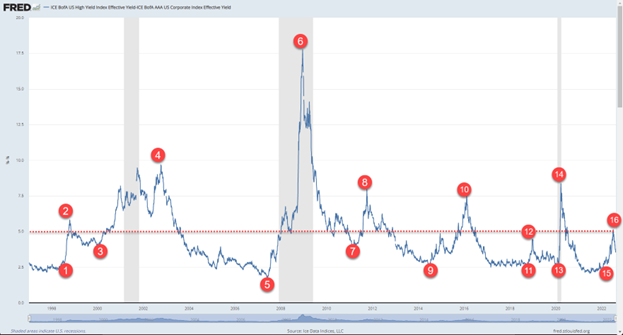
One indicator we like to watch is the spread between high-yield corporate bonds and investment-grade bonds.
High-yield corporate bonds typically have a higher yield (hence the name) than investment-grade corporate bonds because the companies that issue them are deemed to be at a higher risk of defaulting on the bonds. Bond traders demand a higher yield on these bonds to compensate them for the increased risk they are taking.
When the economy is strong, the spread between the yield on high-yield corporate bonds and investment-grade corporate bonds is typically smaller because the risk of any company defaulting on its bonds during good economic times is lower.
However, when the economy is weak – or expected to get weaker – the spread between the yield on high-yield corporate bonds and investment-grade corporate bonds gets wider because the risk of default increases when times are tough.
You can see this play out in the spread chart comparing the ICE BofA U.S. High Yield Index Effective Yield and the ICE BofA AAA U.S. Corporate Index Effective Yield below. The spread gets wider during difficult economic times, especially recessions (which are highlighted in gray on the chart).
We know that’s a lot of high-level, complicated bond talk, but this does help us as stock traders.
You can see how the changes in the corporate-bond yield spread coincide with the movement of the S&P 500. When the corporate-bond yield spread reaches a low point and starts to widen (see the odd numbers in the previous chart), the S&P 500 tends to hit a peak and starts to drop (see the odd numbers in the chart below).
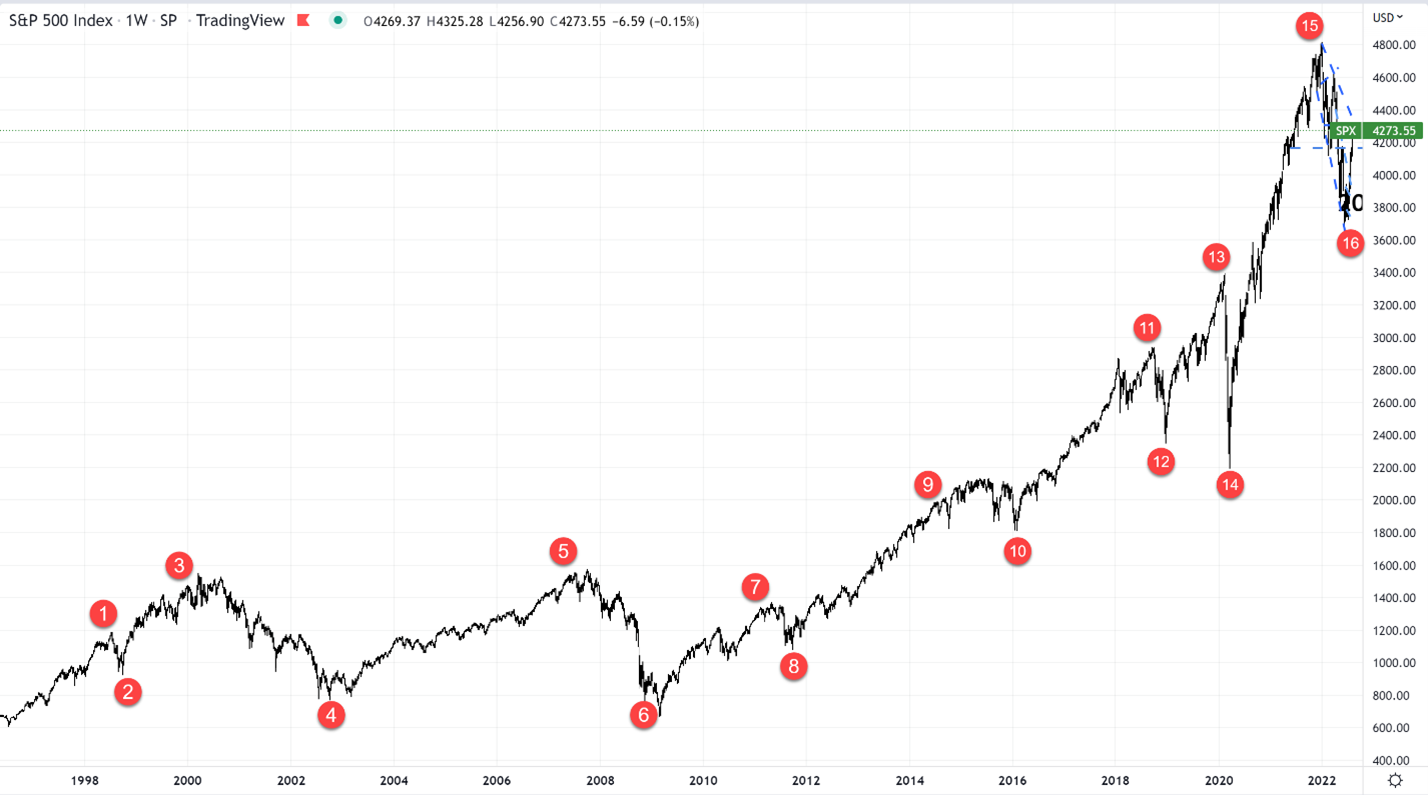
Conversely, when the corporate-bond yield spread reaches a high point and starts to narrow (see the even numbers in the first chart), the S&P 500 tends to hit a bottom and begins to rise (see the even numbers the second chart).
This same concept also applies to shorter time frames.
Looking at the shorter-term corporate-bond yield spread chart in our next chart, you can see that the spread has been steadily climbing since the beginning of 2022.
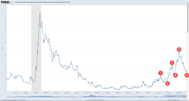
It has had a few ups and downs while it has climbed, and these swings have lined up nicely with the swings in the S&P 500 (see below).
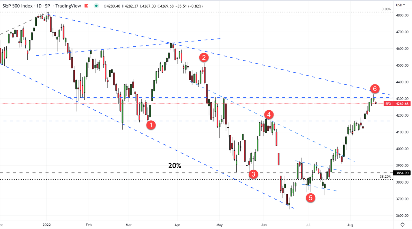
The question we have now is whether the corporate-bond yield spread hit a high at #5 (see the third chart) and is now beginning a new downtrend…
One Day to $2,475?
An analyst here at InvestorPlace has shown readers how they can receive an instant cash payout of as much as $2,475 – in a single day. Even when the market crashed and recovered last year, you could have collected payouts like $1,655… $1,480… and $1,375… every day the market was open. See how, right here.
Bottom Line
If the corporate-bond yield spread bounces a little bit at #6 (see the third chart) but ends up forming a new high that is lower than #5, it tells us the S&P 500 has a better chance of breaking above 4,300 in the coming months.
This might not signal a new bull market quite yet, but opportunities will indeed come if the tide changes.
Regards,
John and Wade