
You’ve probably seen it splashed everywhere – “Yield Curve Steepens to Multi-Year Highs,” “Bond Market Flashes Caution,” “Is the Soft Landing in Sight?”
The yield curve has gone from an obscure chart on bond desks to front-page material because it’s one of the few indicators that consistently front-runs the big turns in the economy.
I still remember back in 2006, when the curve inverted ahead of the financial crisis. Hardly anyone outside of bankers, economists, hardcore investors and bond traders knew what it meant. But by 2008, every newspaper in America was running stories about the “inverted yield curve” that had signaled disaster. That moment put the yield curve on the public’s radar for good.
Now, whenever it flips or steepens dramatically, people pay attention – because history has shown it isn’t noise, it’s the market’s smoke alarm.
And here we are again in 2025. After the longest inversion in history, the yield curve has snapped back into positive territory. Some pundits are calling it a sign of confidence. Others say it’s the prelude to a recession…
Either way, it’s the bond market’s way of telling us one thing — “Pay attention!”
What the Yield Curve Actually Is
At its core, the yield curve is a simple graph showing the interest rates the U.S. government pays to borrow money — from 3-month Treasury bills all the way out to 30-year bonds.
Under normal conditions, the curve slopes upward: short-term rates are low, long-term rates are higher. That’s logical. If you’re going to lend your money for 30 years, you demand a higher return than if you’re parking it for 3 months.
But when that slope flattens – or worse, inverts – everything changes. An inversion is when short-term rates rise above long-term rates. That’s the bond market screaming: “Trouble ahead.” Historically, every U.S. recession since 1960 has been preceded by a yield curve inversion. Not a coincidence. A warning.
On the flip side, when the curve steepens – long rates moving further above short rates – it can mean one of two things: optimism about growth, or panic as the Fed slashes short-term rates into a weakening economy. Context is everything.
Winding Through History
Let’s walk through a few key chapters to see how the yield curve has guided traders before.
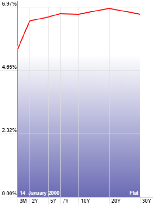
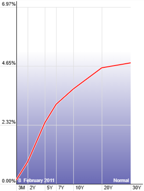
Back in 1999 to 2002, the yield curve was unusually flat. Short-term and long-term rates were nearly indistinguishable, which is exactly the setup we see today. That flattening was a clear sign of stress building beneath the surface. Not long after, the dot-com bubble burst and the S&P was hammered. Traders who were paying attention to the curve already had reason to be cautious before the headlines caught up.
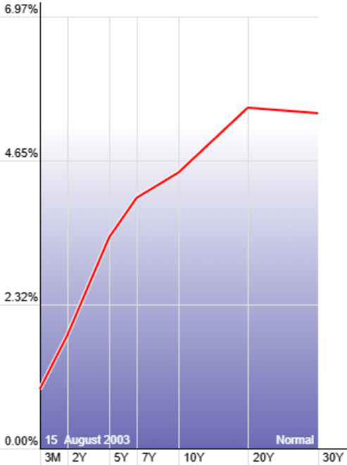
From 2003 to 2007, the curve regained a beautiful, healthy upward slope. Short-term borrowing costs were low, long-term rates higher, and that “normal” curve gave the economy plenty of fuel. Equities responded with one of the strongest bull markets in history. A sloping, healthy curve acted as the wind at the market’s back, and anyone who stayed long during those years was rewarded.
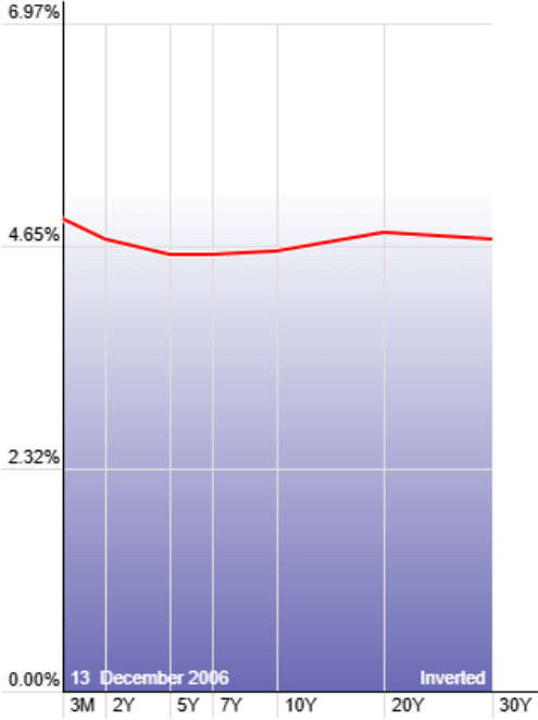
But by 2006 into 2008, the story flipped again. The yield curve inverted, signaling that short-term borrowing costs were too high compared to long-term expectations. Bond traders saw the risk building months before it spilled into equities. Then came the financial crisis, which devastated global markets. I’ll never forget it because 2008 ended up being my best trading year ever—not because the market was “good,” but because the yield curve told me exactly where the danger was rising.
From 2009 through 2019, short-term rates were pinned near zero, and the curve steepened sharply. That gave companies and consumers cheap access to credit, creating the perfect environment for risk assets to run. Stocks climbed steadily during this decade-long expansion, with the steep curve acting like rocket fuel underneath the rally. It’s a textbook example of how supportive a healthy, upward-sloping curve can be for equities.
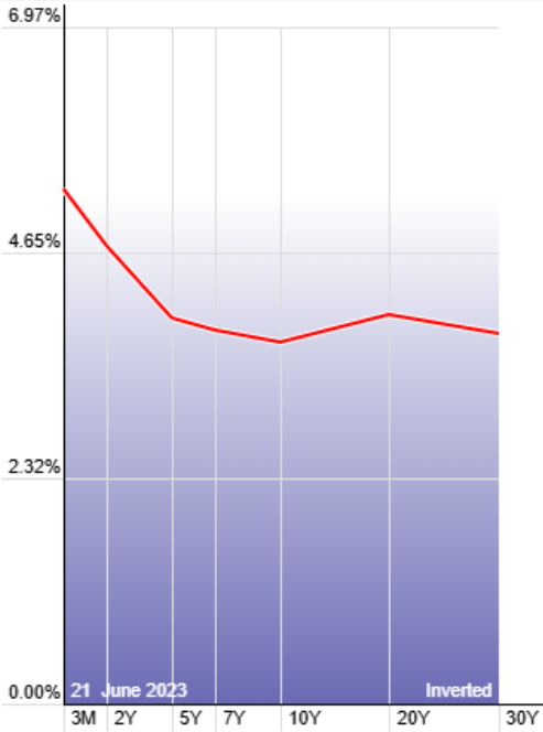
In 2019 into 2020, the curve began to invert once more. At the time, many commentators debated whether it was just a false alarm. Then COVID hit and the sharpest recession of our lifetimes followed. The inversion was the bond market’s smoke alarm ringing loud and clear before the chaos arrived. It reminded everyone—once again—that ignoring the curve is a costly mistake.
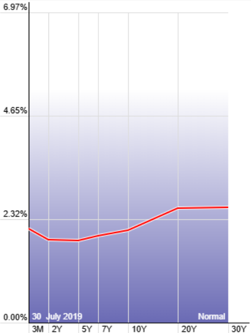
More recently, from 2022 through 2024, we saw the longest yield curve inversion in U.S. history. The 2-year yield stayed above the 10-year for more than two straight years, breaking every prior record. Economists, traders, and journalists all sounded the alarm, with many predicting an imminent recession. But the economy proved surprisingly resilient. Inflation cooled, unemployment stayed low, and growth chugged along, leading some to wonder if this was the rare case where the curve’s warning might not come true.
Why the Curve Matters Right Now
Here’s where we stand in 2025. After the longest inversion on record – more than two straight years – the curve has un-inverted and started steepening again.
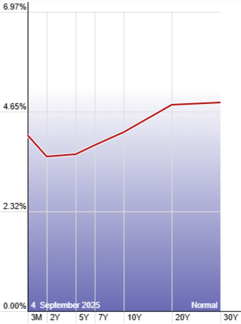
The 2-year yield now sits about half a point below the 10-year. Meanwhile, the 3-month to 10-year spread, one of the Fed’s favorite gauges, is basically flat.
A few key factors are driving these dynamics:
- The Fed pivoted. After hiking aggressively in 2022–23, they’ve already started cutting rates modestly. That pulled short-term yields down.
- The economy’s held up. Stronger labor markets, resilient consumer spending, and business investment surprised a lot of people.
- Long-term rates caught up. Investors demand more yield for holding long bonds, reflecting both resilience and heavy Treasury issuance.
Some see this as a bullish sign—the possibility of a soft landing where inflation comes under control without a recession. Others see it as history repeating: the curve un-inverting right before the slowdown actually arrives. Either way, the bond market is speaking, and the curve is once again at the center of the story.
The thing to always remember is this: the Fed only controls the short end of the curve. Powell and company can push down 3-month, 6-month, even 2-year rates. But the long end — the 10-year, the 30-year — that belongs to the market. And right now, I think that’s where the real risk is hiding.
In my view, the Fed is 100% going to cut in September. That’s going to drag short-term yields lower. But here’s the kicker: the long end could actually rise at the same time. That kind of steepening isn’t healthy. It’s artificial, it’s political — and while the Fed tries to “thread the needle,” the free market pushes back.
Cut too little, and they risk driving us into a recession. Cut too much, and inflation expectations can come unanchored. That’s the knife’s edge they’re walking.
We’ve seen that movie before. Back in 2007 and 2008, the Fed tiptoed into cuts but didn’t want to pre-commit to a deeper easing cycle. They tried to control the short end while the long end refused to play along. The curve steepened — not because growth was booming, but because the bond market smelled trouble. We all know what happened next.
What This Means for Traders
Here’s where all this history comes together. Right now, we’re at the start of another tightening cycle. The Fed has pivoted from aggressive hikes to modest cuts, but policy is still restrictive, and the market is wrestling with how long this phase will last.
Short-term, stocks are likely to rally when the Fed cuts. Rate-sensitive names — tech, REITs, anything tied to cheap borrowing — tend to pop when yields at the front end fall.
But the real concern is what happens if unemployment keeps ticking higher. The Fed can lower 3-month, 6-month, or even 2-year rates, but they can’t control the 10-year or 30-year. And if the labor market weakens, earnings pressure will mount just as long-term yields climb. That’s the recipe for an “artificial” steepening — one that signals stress rather than strength.
A truly supportive steep curve gives markets room to run. A policy-driven steepening does the opposite. It means borrowing costs for mortgages, corporate bonds, and long-term investment rise just as the Fed is trying to stimulate growth. That disconnect has marked the start of trouble in past cycles — 2007–08 being the clearest example.
So the underlying question traders need to ask is: How has the market performed when the Fed has moved rates in the past? The yield curve gives us the roadmap.
The good news is you don’t have to guess. Tools like the St. Louis Fed’s FRED database or — my personal favorite — StockCharts’ dynamic yield curve let you line up past tightening cycles against S&P performance. The patterns are there in black and white. Study them, and you’ll see the relationship between Fed cuts, yield curve shifts, and equity performance.
And there’s more good news for traders looking to keep their money at work wherever the markets ultimately end up…
While we can’t say for sure what happens beyond September, none of us should be panicking or sitting on the sidelines.
If there’s one thing this market has taught us, it’s that uncertainty creates volatility. And here at Masters in Trading, we’ve been absolutely crushing volatile markets all year.
From that major victory trading an Ethererum ETF that wasn’t on anyone’s radar …
To our massive wins in stocks like TMC (a play on deep-sea exploration) and QXO (builder consolidation)…
Masters in Trading has consistently delivered unique setups with massive upside potential – wherever volatility takes shape.
And the Masters in Trading Challenge is designed to show you exactly how we pull off volatile trade setups with conviction, process, and solid options fundamentals.
You can click here to learn more and sign up for the Masters in Trading Options Challenge.
In trading, the edge comes from anticipating what most people only recognize in hindsight. Right now, the curve is telling us that risk is elevated, the Fed’s hands are tied to the short end, and the long end could still surprise us.
Know the curve. Respect its history. And trade with your eyes open. The yield curve is telling a story — and it’s one you can’t afford to ignore.
Remember, the creative trader wins.
Jonathan Rose,
Founder, Masters in Trading
P.S., While the yield curve may be flashing its warning, there’s another story unfolding right now that could hand traders a very different kind of opportunity.
On Sept. 10th at 10 a.m. ET, my colleague Eric Fry is set to reveal an obscure AI robotics company he’s calling “Nvidia on Steroids.” His new Apogee stock-picking model flagged this name using the same rare 10X Pattern that appeared before Nvidia’s 1,871% run, Apple’s 4,285% surge, and Amazon’s 1,115% climb.
Eric will be unveiling the full details of this opportunity — down to the ticker symbol — in a special event called Eric Fry’s 10X Breakthrough. It doesn’t cost a dime to attend, but you need to reserve your seat. [Click here to secure your spot now.]