It wasn’t clear they were ready to make it happen early in the day, but as Thursday’s closing bell neared, the bulls went to work. The S&P 500’s 0.61% gain yesterday marks the third straight daily advance, and although it took shape on weakening volume, stocks are at least further away from immediate danger.

Advanced Micro Devices (NASDAQ:AMD) and Snap (NYSE:SNAP) did more than their fair share of the heavy lifting. The computer hardware company’s stock jumped nearly 8% after Morgan Stanley finally reversed its long-standing bearish view, while shares of Snapchat’s parent popped almost 7% in response to an upgrade from Pivotal Research’s analyst Michael Levine. Levine says the company has “turned the corner” on user growth.
At the other end of the spectrum, China’s electric carmaker Nio (NYSE:NIO) saw its stock fall more than 6% on Thursday, unable to hold onto Wednesday’s gain that indicated strong deliveries for May.
None of those names are particularly great trading prospects as we move into the final day of the week. Rather, take a look at stock charts of AT&T (NYSE:T), KeyCorp (NYSE:KEY) and Metlife (NYSE:MET). Here’s why.
Metlife (MET)
In mid-April we pointed out Metlife shares were knocking on the door of a breakout effort. A horizontal ceiling at $46.30. If it could be hurdled, the bulls would have a much easier time pushing it even higher.
Although not straightaway, that happened. After peeling back in late April, the bulls pushed off the 50-day moving average line to blast past $46.30 in early May. Since then, a new horizontal range has developed, though MET stock is about to punch through it as well. That could really open the floodgates to more buying.
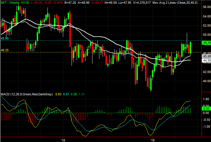
Click to Enlarge
- The line to watch from here is $48.80. Plotted in blue on both stock charts, that’s where Metlife ran into trouble a couple of times last year, and near where it has been capped since last month.
- Working against more upside is Tuesday’s bullish gap; it may need to be filled in before moving ahead.
- Also note that all four key moving average lines are now sloped upward, indicating a bullish undertow in multiple timeframes … one of the telltale clues that any trend is healthy.
AT&T (T)
The last time we looked at AT&T back on April 2, the stock had just broken above a long-standing resistance line at the same time it popped above its key 200-day moving average. Although far from assurance that higher highs awaited, it was the best evidence of gains we’d seen in years.
Things have remained choppy in the meantime, though progressive. We’ve seen higher highs and higher lows, solidifying the turnaround effort. Although more up and down is likely, T shares are one good “oomph” away from breaking all the way out of a downtrend and back into rally mode.
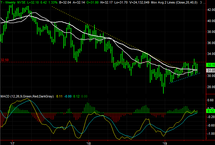
Click to Enlarge
- Since April, a near-term technical floor has materialized, plotted in blue on both stock charts. The current effort is the result of pushing up and off of that floor.
- Also, since that last look, the purple 50-day moving average line has crossed above the white 200-day line … a so-called “golden cross” that portends bigger-picture bullishness.
- A break above the technical ceiling around $32.50, plotted in red on both stock charts, will likely put the long-term weakness out of sight and out of mind.
KeyCorp (KEY)
KeyCorp has been run through the same basic wringer as most other bank stocks have of late. That is, an ugly December, a great January, a so-so February, a tough March followed by a great April, leading into a setback in May. June is still up in the air.
There has been far more structure to the ebb and flow KEY stock has been through recently than there has been for other banking stocks. The end result is a well-defined converting wedge pattern that’s putting KeyCorp in good position for a breakout thrust. The big ceiling ahead is indeed a BIG ceiling.
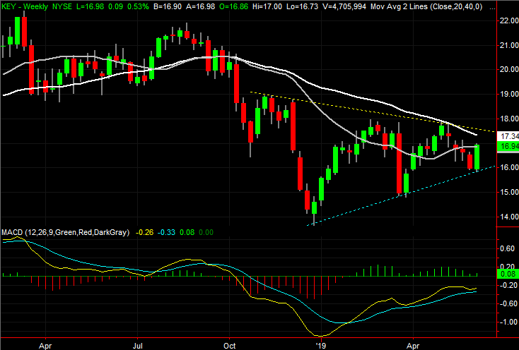
Click to Enlarge
- The current advance is the result of a push up and off the floor that has tagged all the key lows since December, plotted in blue on both stock charts.
- The upper boundary of the wedge shape is plotted in yellow on both stock charts, lining up the major highs, but also lining up with the 200-day moving average line plotted in white on both charts.
- Although it wouldn’t take shape until after several days following a move above the 200-day moving average line, all the other moving average lines are on an intercept course for the 200-day line, which would bolster bullishness.
As of this writing, James Brumley did not hold a position in any of the aforementioned securities. You can learn more about James at his site, jamesbrumley.com, or follow him on Twitter, at @jbrumley.