A 30K-foot view on this pullback … PCE inflation tops estimates … is the pullback so far normal? … the primary driver of the bull market this year
The market is up as I write Friday morning. It’s a combination of “relief rally” and strong earnings from Alphabet and Microsoft last night. But the entire month of April has been weak.
Let’s step back to take a 30K-foot view of what’s been happening.
Can we brush off several weeks of poor market behavior as normal volatility or should we brace ourselves for something worse?
Let’s start with inflation, which has been reaccelerating in recent months.
The hope back in January and February was that the hotter data represented a temporary blip. Just a minor reversal in inflation’s multi-month slowdown. Well, we can no longer come to that conclusion in good faith based on the data.
We’ve now had a string of Consumer Price Index (CPI) reports that have all come in hotter than expected. Below is a visual showing headline CPI having turned back north (solid dark blue line), and core CPI (which strips out volatile food and energy prices) flatlining (dotted light blue line).

This morning brought the latest inflation news.
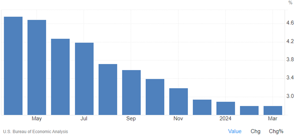
The latest personal consumption expenditures (PCE) price index showed that core PCE jumped 2.8% year-over-year in March. This was higher than the 2.7% forecast. At least the monthly reading was in line at a 0.3% gain.
As you can see below, the good news is that core PCE isn’t shooting higher. But the bad news is it’s plateauing at 2.8%, which is well above the Fed’s target rate of 2.0%.
This reinflation has resulted in a one-two punch combo for stock market bulls
Punch one: Based on the hotter inflation data, the bond market is realizing the Fed has no real reason to cut rates soon, so it’s pushing yields higher, which stocks don’t like.
The 10-year Treasury yield reached 4.73% yesterday, the highest yield since last November. It’s pulled back to 4.65% as I write Friday, but the trend is clearly “up” as you can see below.
This is a “danger zone” reading.
From Bloomberg:
The Treasury market is nearing levels that risk triggering a large selloff, pushing yields on 10-year bonds back to 5%, according to Vanguard.
“We are in a danger zone right now,” Ales Koutny, head of international rates at Vanguard, said in an interview. Even a small move higher — past the critical 4.75% level — could force investors to abandon their bets on a rally, giving way to a wave of selling that could push yields toward the highs of 2007, he said.
Punch two: Based on the inflation data, an increasing number of bulls are reconsidering expectations for multiple rate cuts in 2024.
As I write, traders are putting the heaviest odds on just one quarter-point cut by the end of the year. Meanwhile, more than one Federal Reserve official has suggested there could be zero rate cuts this year.
The problem is that despite this recent market pullback, many stock prices still reflect the year-to-date run-up from bulls who were anticipating a slew of rate cuts. Though the market might feel like it’s imploding, the reality is the S&P and Nasdaq are just 3% below their all-time highs as I write. The Dow is off barely 4%.
This leaves many stock prices – now less supported by the expectations for multiple rate cuts – appearing extended and increasingly fragile.
But what about earnings? Might they be a buttress against this fragility?
Hold on that. We’ll circle back.
Let’s pause here to get a bearing on where we are with this correction
Below, we look at the S&P over the last two years. There’s a well-defined resistance line of the uptrend channel that’s marked with a solid blue line.
What’s less clear is the support line of this uptrend channel. I’ve added a reasonable estimation of where it could be by trying to mirror the slope of the resistance line. This is in dotted blue.
As you can see, the S&P has fallen roughly 3% from the top of its channel (a few days ago, we were 5.5% down, top to bottom).
In the grand scheme of things, this type of 3% drop (or even a 5.5% drop) is nothing. I believe the technical term is “yawn fest.”
Here’s a reminder of what’s “average” for the S&P in any given year, courtesy of analyst Ryan Detrick:
- More than 7 separate 3% dips
- More than 3 separate 5% mild corrections
- A 10% correction once a year
Technically, the S&P could fall to roughly 4,750, which is the lower bound of the trend channel as drawn above and remain in its bullish uptrend.
If that happened, the S&P would fall another 7% from here, which would check the box on Detrick’s “average” of a “10% correction once a year.”
Now, this doesn’t mean we can shrug off this pullback. As we asked at the top of this Digest, we need to assess if we’re watching normal volatility (which we can shrug off), or a prelude to a far bigger crash that can derail investment goals and retirement plans.
No one has a crystal ball, but here’s our thinking…
Breaking down the S&P’s P/E ratio
A stock price is a function of two variables: a company’s earnings and the multiple that investors are willing to pay for those earnings (which is a proxy for “sentiment”).
All three variables interact in a stock’s price-to-earnings (P/E) ratio.
So, what has the S&P’s P/E ratio done so far this year?
As you’ll see below, it has increased as much as 10% before pulling back to about 6% as I write. Meanwhile, note that the S&P’s earnings so far this year (in green) are flat because we’re only now seeing the results of Q1 earnings season.
Let’s take it back one more quarter for added perspective.
Below, you can see the S&P’s P/E ratio in black (remember, a proxy for sentiment) outpacing earnings, in green, since Q4 of last year.
The simplistic takeaway is that the run-up in stocks in recent months has been heavily driven by sentiment.
So, as we see the “multiple rate-cut” narrative collapsing, this is a blow to bullish sentiment. In fact, much of the recent pullback is due to investors suddenly being unwilling to pay as much for stocks (the falling P/E multiple) in the face of a “higher for longer” interest rate regime.
With sentiment losing its momentum in recent weeks, that shoves earnings squarely into the spotlight.
And how are we doing there?
Let’s look at forward expected earnings. After all, it’s more important to look at what’s coming than what’s happened.
Below is a chart from FactSet that compares the forward 12-month earnings-per-share (dark blue) with the S&P’s price (light blue).
Note two things:
First, though the price of the S&P bounces around frequently, it’s clear that it oscillates around the forward earnings-per-share line, which acts as an anchor. That forward earnings-per-share line even appears a bit like a median reading of the S&P.
Second, note how high the S&P’s price is relative to today’s forward earnings-per-share line – as well as what direction the S&P went the last time it was this high.
Clearly, the S&P is stretched relative to its forward earnings-per-share. This suggests greater risk of more downward pressure ahead.
So, if we’re going to sidestep significant market weakness, we need earnings to come in very strong. Not just this quarter, but as we move deeper into the year.
So, will earnings come in strong?
That question points us toward one main variable…
The U.S. consumer.
Can the U.S. consumer outlast the Fed?
Here’s how we framed the issue back in our February 16th Digest:
As it stands today, this has all the makings of a photo finish…
Will the U.S. consumer be able to hold out until the Fed lowers interest rates, taking pressure off nosebleed credit card interest rates and balances, as well as squeezed household budgets?
Or will more sticky inflation data mean the Fed doesn’t cut rates anytime soon, which causes consumers to tap out and stop spending later this year, dashing hopes of a soft landing?
Well, even though “sticky inflation” and “no rate cuts anytime soon” appear to be in the cards, perhaps this isn’t as black and white as we framed it before. After all, the resilience of the U.S. consumer has been relentless, surprising just about everyone.
Can this consumer strength continue?
Since we’ve covered a lot of ground in this Digest, let’s make this analysis simple by focusing on one thing – overall retail sales.
As you can see below in the chart dating back to 2019, retail sales have slowed, but they’re still grinding higher, ever so slightly.
And this morning’s PCE report showed continued spending. From CNBC:
Consumers showed they are still spending despite the elevated price levels.
Personal spending rose 0.8% on the month, a touch higher even than the 0.7% estimate though the same as February. Personal income increased 0.5%, in line with expectations and higher than the 0.3% increase the previous month.
Putting everything together, what’s our takeaway?
For now, we’re giving the edge to this recent market weakness being normal volatility rather than the beginning of a more dire bear market.
We could be wrong, but the U.S. consumer has defied expectations for so long, we must give him/her the benefit of the doubt. By extension, we must give upcoming earnings the benefit of the doubt.
Now, that doesn’t mean we won’t see lower stock prices. Despite today’s market action, investor sentiment has been souring, and as we highlighted above, and the S&P’s price remains high relative to its forward earnings-per-share estimate.
So, we could easily see the S&P fall to its channel support line – or even to its 200-day moving average, which is at roughly 4,686. That’s about 8% lower from here.
We should be emotionally prepared for that.
But until we see more evidence of deteriorating consumer spending resulting in crumbling earnings, we’re cautious, but not expecting “maybe 8% lower” to turn into “brace for 28% lower.”
In any case, mind your stop losses, mind your position sizes, and don’t overextend yourself relative to you and your family’s financial needs – but with those safeguards in place, remember the wisdom from the great Peter Lynch:
Far more money has been lost by investors trying to anticipate corrections, than lost in the corrections themselves.
Have a good evening,
Jeff Remsburg